Whether you’re looking to upgrade your eCommerce website or SaaS offering, great design is key to an enhanced user experience (UX). It attracts users, leaves a lasting impression, and leads them smoothly along their customer journey.
When implementing effective UX design on your website or across your channels, one of the most important things to keep in mind is visual hierarchy.
What is visual hierarchy?
Visual hierarchy is a method used by designers to rank elements of design, showing their importance on a page so users can navigate information easily. By making it a priority, you’re able to control the experience users have, helping the most important elements to stand out.
Several principles can be applied to achieve visual hierarchy, boost sales engagement, and create a great UX. If users can navigate a page easily, their chances of engaging with your products or services are higher, meaning a greater ROI and increased revenue for your brand.
Cultivating this enhancement of the user experience is essential to the long-term success of your business. Creating an improved UX will not only grow a product or service’s usability but reflect well on your brand. Users will be more likely to leave positive reviews, impacting the perception of future buyers and leading to more sales.
Whether you’re an amateur, trying your hand at some UX design freelancing, or have an entire team to hand, we’ve created a list of the top eight principles of visual hierarchy to consider during the design process.
1. The Gestalt principles
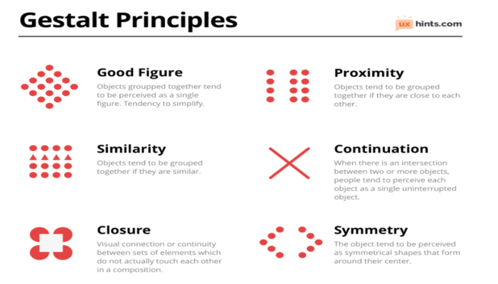
Before we go any further, we want to explain the Gestalt principles. A psychological theory, these focus on how humans understand the things they see. According to this theory, we tend to group similar objects to recognize patterns that simplify our overall perception.
This theory is rooted in six unique principles: closure, continuity, similarity, common fate, figure and foreground, and proximity.
While retail trends come and go, the Gestalt principles have remained a timeless method for attracting and retaining users.
2. Figure and foreground; playing with perspective
According to this principle, humans look for solid items when scanning a page to avoid uncertainty. We can apply this to visual hierarchy by playing around with the user’s perspective, determining what things we want to draw their attention to.
The simplest way to play with perspective is by focusing on user interfaces. Whether you’re designing an app or a website, focus the user’s attention on specific elements by either making them in focus or out of focus.
This can be achieved by making the background blurry and the central image in focus – simply put, you’re playing around with how the user perceives distance and separation.
3. Proximity; using space to guide the reader
This principle focuses on how designers play around with space to group elements together or separate them. By grouping elements, such as your product or service’s features, users recognize they’re interconnected, making their navigation journey easier.
If you’re going for a minimalist look or want to draw attention to an important feature, consider white-spacing. While it’s important to think about how you’ll fill space, it’s as essential to recognize the impact leaving it blank can have.
Simply put, white spacing is the process of leaving large, blank spaces between different elements in the layout design. It leaves your page looking clean and uncluttered while guiding the reader to the most important elements.
4. Continuity; creating alignment on screen
This principle focuses on how you can enhance the UX by creating alignment onscreen. To spark this connection within a user’s mind, create alignment using similar elements. This helps users see the association between them more clearly, guiding the way they view your page.
A simple way of creating this alignment is to use tables and navigation bars. When designing these elements, be sure to align their contents into specific columns and connect them horizontally.
Since this is a simple task, you can use website builders to create these alignments for you and save time if you don’t have a team to hand.
5. Typography
When designing, typography is a crucial element that needs to be considered so attention is drawn to the most important features. It helps guide users as they’re reading the text on a page and includes:
I. Typeface, fonts, and headings
Though fonts fall under the same branch as typefaces, they’re not exactly the same. The typeface includes all the common text designs while the font includes the subcategories of these designs.

Choosing the right fonts and typefaces can interject a bit of creativity and personality into your pages. By contrasting certain typefaces or using larger fonts, you’ll be able to make the most important features stand out.
This is especially useful for features like the FAQ page, when you’re listing questions, or when making bold statements about your product’s features in a description.
You can also play around with headings, either enlarging or decreasing their size to help features stand out, separate sections, and guide users from one point to another.
6. Reading patterns; Z and F patterns
Since users are more likely to scan a page rather than read the entirety of its content, it’s key that designers compose effective layouts for reading.
I. Z-pattern
The Z-pattern focuses on how users read text from top to bottom and left to right, essentially tracing the route of the human eye. It’s important to remember that, though common, this pattern most often occurs on pages with more visual than written content.
Z-patterns are commonly found on homepages and log-in sections, so deploy design elements based on this pattern in specific areas.
Armed with this knowledge, designers can place key information in a Z-reading pattern format, from the corners of the page to the bottom.
II. F-pattern
Unlike the Z-pattern, F-reading patterns occur on pages where there is more written content than visual. For this reason, it’s best to deploy design elements based on this only when faced with text-heavy sections such as blog articles or FAQs.
Simply put, when following an F-reading pattern, users scan the page vertically and enter the content in horizontal lines. Users scan text-heavy pages in this way because they’re often looking for a solution or information quickly, so aren’t willing to read the content in its entirety.
When designing text-heavy pages, be sure to place key information near the beginning and use appropriate headers to separate sections.
7. Font colors and contrasting
One of the simplest categories of typography is font color; will you go with dark, light, or bright colors? The key is to think about what kind of color scheme you have already set up to find a color that blends and to think about the overall image of your brand. What kind of message are you trying to portray and what colors best convey this?
8. Designing with mobile UX in mind
When designing pages, be sure to remember any design specifics that mobile users will encounter. Since the screen space will be smaller, you need to make sure the most important elements stand out without cluttering the space. This is why minimalist designs work better on mobile as information can be clearly seen, simplifying navigation.
Communicating with your UX designers
When applying these principles of visual hierarchy, be sure to communicate what you want to your UX designers. It’s important to remember that although the design is key to an effective user experience, the back-page and strength of your website are also crucial. Combine your design efforts with an updated IaaS for your business so both design and functionality run smoothly.
Even if you operate remotely, keep a conversation going between you and your UX design team or freelancers. Consider using video conferencing software or a PBX system to keep lines of communication open.
But remember to give your designers a bit of freedom too. Design and innovation is their job, so while it’s good to give them a feel for your brand, don’t overpower them with suggestions. Think about smart ways to use project management solutions to set tasks and deadlines and remain updated on key changes without being overbearing.
The Takeaway
Effective design is key to enhancing product usability and the user experience. Applying these principles of visual hierarchy will help you guide your user along their journey.
Web design trends may come and go, but the principles of visual hierarchy for great UX design will remain timeless. Don’t underestimate their importance!